ShopDreamUp AI ArtDreamUp
Deviation Actions
Description
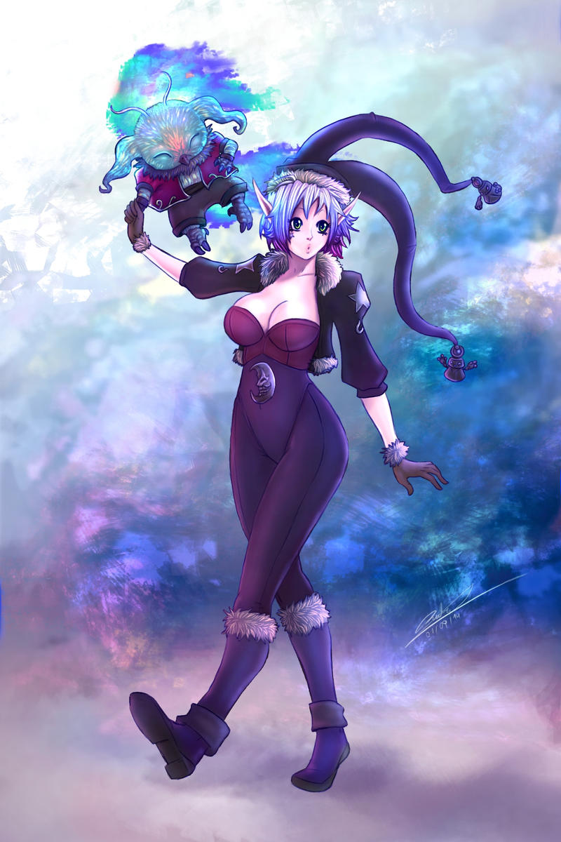
Bueno aca esta Elissya White version 2014 , espero les guste 
Here it is the 2014 version of Elissya White , i hope you like it
Here it is the 2014 version of Elissya White , i hope you like it
Image size
1500x2250px 1.76 MB
Comments12
Join the community to add your comment. Already a deviant? Log In
Okay! Let's begin, shall we?
Vision is 4.5/5 stars. Your character looks really good. The colors stand out and help for her to shine and pop out. I also like how you did her hair with the highlights. It reminds me of an anime called No Game No Life, which was excellent at what you did. Also, her friend she's holding with(i'm not THAT familiar with mythical creatures) looks pretty cool too. The flames he exerts really help compliment the picture. However, the background could use a little more work.
Originality is 5/5 stars. I haven't seen anything like it. That's for sure. Maybe the hat, makes her slightly more generic, but she still looks good.
Technique is 4/5 stars. First off, I think you should work on the background more. It looks fine, but it would certainly help the picture pop. Second, I don't say this often to people when i critique, but...I think you should make the lines around the character lighter. I mean- for her clothes, its okay, but it kills the highlight with her hair when the lines are too bold.
Also, not to sound awkward or anything, but I think you should make the cloth around her chest go up a little higher. Now don't get me wrong, your really good with anatomy, but the cloth around her chest is kind of low(but anyway, this is your choice)
Finally, her hat. I my opinion( don't freak out when I say this) but IN MY OPINION the hat kills her outfit. Now if the hat was a little shorter, than it wouldn't be as bad. However, the way it is, it's kind of awkward because at first glance, I thought it was her pet's tail. But again, this is your choice. The alternate route you could go if you really( and I mean really) want the hat is make the part closest to the head bigger and get smaller going out, that way it looks a bit more natural
Impact is 4.5/5 stars. It definitely shows a curious and almost prankster side to your character. I think it shows her off very well and you should continue to show her off that way.
Overall. amazing job! I've seen your other work too, so...keep it up!
Hope this helped a little!

![[OPEN] Adopt 5](https://images-wixmp-ed30a86b8c4ca887773594c2.wixmp.com/f/e3ef21f8-e6e1-4e42-9146-d90bded88015/dgpr0up-83e0ce6d-7ea4-4573-98cf-604bb51e1fd4.png/v1/fit/w_375,h_548/_open__adopt_5_by_sweetfantasia_dgpr0up-375w.png?token=eyJ0eXAiOiJKV1QiLCJhbGciOiJIUzI1NiJ9.eyJzdWIiOiJ1cm46YXBwOjdlMGQxODg5ODIyNjQzNzNhNWYwZDQxNWVhMGQyNmUwIiwiaXNzIjoidXJuOmFwcDo3ZTBkMTg4OTgyMjY0MzczYTVmMGQ0MTVlYTBkMjZlMCIsIm9iaiI6W1t7InBhdGgiOiJcL2ZcL2UzZWYyMWY4LWU2ZTEtNGU0Mi05MTQ2LWQ5MGJkZWQ4ODAxNVwvZGdwcjB1cC04M2UwY2U2ZC03ZWE0LTQ1NzMtOThjZi02MDRiYjUxZTFmZDQucG5nIiwiaGVpZ2h0IjoiPD0xMTcwIiwid2lkdGgiOiI8PTgwMCJ9XV0sImF1ZCI6WyJ1cm46c2VydmljZTppbWFnZS53YXRlcm1hcmsiXSwid21rIjp7InBhdGgiOiJcL3dtXC9lM2VmMjFmOC1lNmUxLTRlNDItOTE0Ni1kOTBiZGVkODgwMTVcL3N3ZWV0ZmFudGFzaWEtNC5wbmciLCJvcGFjaXR5Ijo5NSwicHJvcG9ydGlvbnMiOjAuNDUsImdyYXZpdHkiOiJjZW50ZXIifX0.I9Rf9Q7If48yQNTaM8PWV_refLqD-TmrpUzpQ_g6G8c)


![Frey [C]](https://images-wixmp-ed30a86b8c4ca887773594c2.wixmp.com/f/73fef6ea-c5c0-4ddb-8589-97c50069520f/dd5fijn-24e1945c-2b7b-4faf-a57e-fc620be031e0.png/v1/crop/w_184)


